
Useful Instagram Stories ads examples show a product, a reason to notice it and a next action that fit one vertical screen. Here are actual Advibly creative assets to inspect, followed by eight patterns for briefing your own version.
The first examples are spec creative, not proof of paid Story delivery or campaign performance. Treat the vertical design as a starting asset; preview the final copy and crop in the actual placement before advertising.
See two different Story-ad jobs
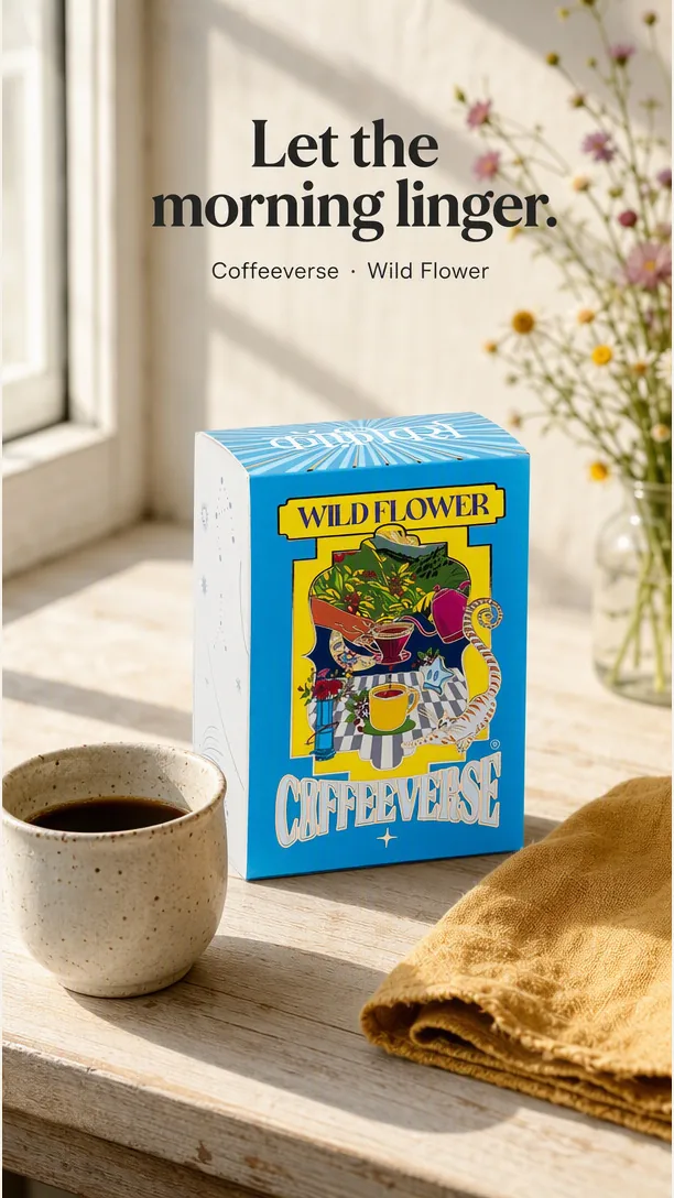
Occasion-led coffee creative: the morning setting and headline work together. This is an actual generated image, not a paid Story or a taste claim.
Coffeeverse Wild Flower product source · Open the 1080 × 1920 proportional export
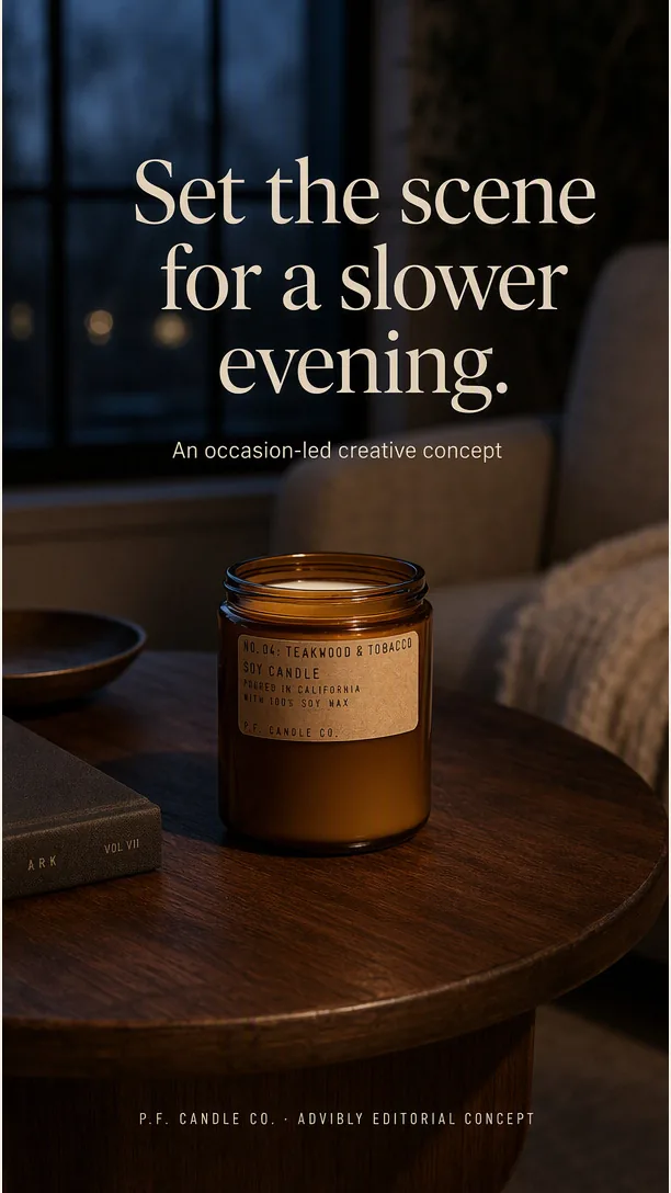
The candle example uses a different category and an evening occasion. The wick is unlit; the scene does not promise better sleep.
P.F. Candle Co. Teakwood & Tobacco Standard Candle product source
The product references below come from the linked public product pages. The advertisements are newly generated Advibly editorial concepts, not the brands’ campaigns, endorsements or customer results. Props, settings and illustrative offers do not establish product performance or what is included in an order.
The patterns below now include distinct visible specimens for product-led, illustrative-offer, context, choice and sequence briefs. Real mechanism tests and customer proof still require genuine source evidence. Create your product scene in Advibly.
Key takeaways
- Show the product early. Give the viewer one reason to care and one clear next action.
- Pick a demonstration when the action itself explains the benefit. Use an offer card when the offer needs little explanation.
- A review, discount, deadline, or product claim needs real support before it goes into an ad.
- Start with two versions that differ in one meaningful way. Choose the success measure before running them.
Which pattern should you use?
|
What your viewer needs |
Pattern |
Material to gather first |
|---|---|---|
|
Recognize the product |
Product-first reveal |
A clear product image and one factual benefit |
|
Understand the deal |
Offer-first card |
Approved offer, eligibility, and end date |
|
See how it works |
Product-in-action demo |
A real recording or product demonstration |
|
Recognize their situation |
Context callout |
A specific use case the product genuinely serves |
|
Choose an option |
Choice montage |
Distinct products organized by a useful rule |
|
Trust a claim |
Customer or creator proof |
Permissioned evidence and relevant disclosure |
|
Follow several steps |
Three-card sequence |
A separate message and next action for each card |
|
Find what suits them |
Self-selection question |
Meaningful choices and a matching destination |
If you aren't yet sure what the advertisement needs to explain, start with these broader product advertisement examples. A Story layout comes after the message, not before it.
1. Product-first reveal
Put one recognizable product in the center of the frame. Use the headline to explain the benefit that the picture cannot show on its own.
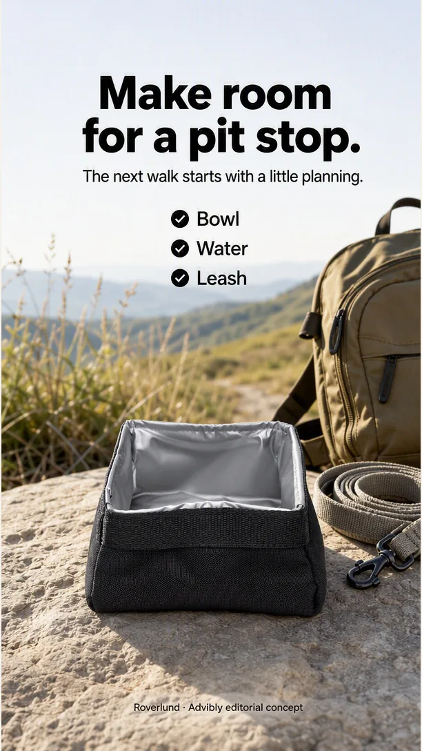
Product-led specimen: the empty bowl is recognizable and the checklist supplies the reason to notice it. Generated packing context is not proof of real use or capacity.
In HubSpot's historical Story-ad collection, Aveeno's moisturizer appears prominently beside a short benefit statement and a shopping action. The reusable lesson is the hierarchy: product, reason to consider it, next step. The example does not establish how a similar ad will perform for your brand.
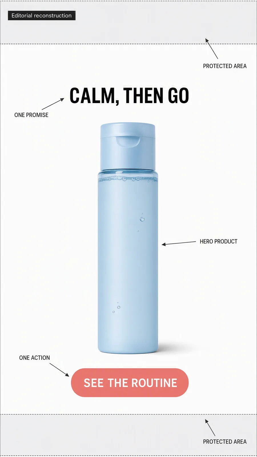
Original layout illustration, not an Aveeno ad. It demonstrates placement only: “Calm, then go” is sample creative copy, not a specific benefit or verified product claim.
Sample execution: a zippered notebook cover. Photograph the cover open with a notebook and pen inside. Put “Notebook and pen. One place.” above it, and use “See the inside” as the action. The image supplies the evidence: the reader can see where the objects fit.
This is more useful than “Upgrade your everyday,” which leaves the product's benefit unexplained. Keep decorative props outside the area that shows the pockets and closure.
For the first variation, replace the open product shot with a hand holding the closed cover. Keep the headline and destination unchanged. You are comparing a view that explains storage with a view that explains portability.
2. Offer-first card
Lead with the deal when it can be understood without a long introduction. The product should still be visible, so the offer has an object rather than floating above an unrelated background.
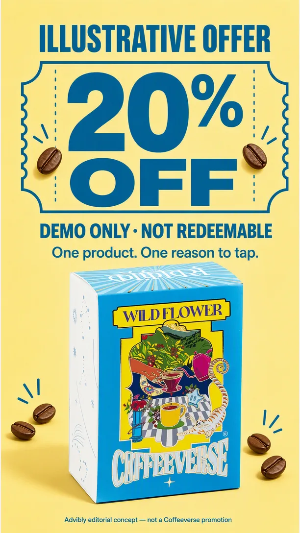
Offer-format specimen only: “ILLUSTRATIVE OFFER” and “DEMO ONLY · NOT REDEEMABLE” are part of the image. The 20% figure is not a Coffeeverse promotion. Replace every term with a real approved offer before use.
HubSpot's Crest example uses a discount as the main reason to act. Treat that as a historical layout observation, not a current Crest promotion.
Illustrative offer: two desk mats for $40. Assume the individual price really is $25, both mats qualify, and the promotion is approved. Two honest headline options are:
- “Two desk mats for $40.”
- “Save $10 when you buy two.”
Show both mats together. Keep the bundle contents, price, and qualification readable on the card. Link to the bundle, not a homepage where the viewer has to rebuild the offer.
Those sample prices are teaching inputs, not a real promotion. Replace them with approved terms. Don't add a countdown unless there is a genuine deadline, and don't shrink an important condition until it is effectively invisible.
3. Product-in-action demo
A demo is useful when the viewer needs to see a mechanism. Show the action that proves the claim; don't substitute an animated headline for it.
Kayak's example in HubSpot's collection demonstrates flight filtering. The relevant detail is the interaction, not a claim that every product should copy a travel app's creative.
Sample execution: a desk lamp with an adjustable head. Use a fixed camera and a real lamp. Start with the light pointing beside the notebook, turn the head, then hold on the illuminated page. Caption the action with “Point the light where you need it.”
Record the movement without cutting across it. A cut can hide whether the product actually does what the ad implies. Avoid claims about brightness, eye strain, or energy savings unless you have suitable evidence for those claims.
For an app, use the same approach: record one real task from its starting state to its result. Enlarge the relevant part of the interface and remove private information. Keep enough context for a viewer to understand what changed.
An outcome-first variation can begin with the finished state and then show the action. Compare that with the action-first version using the same underlying recording.
4. Context callout
Name a situation that makes the product useful. “For busy people” is too broad to give a designer much direction. “Your desk becomes the dining table at six” creates a scene.
Context specimen: the evening scene supplies an occasion without inventing a new benefit or discount.
Sample execution: a portable desk organizer. Open on a dining table holding a laptop, charger, and notebook. Show those items being gathered into the organizer, then show the clear table. Use “Pack up your workday” as the headline and “See what fits” as the action.
The setting supplies the reason to care. You don't need to claim that the organizer transforms productivity or saves a precise number of minutes.
Check the product's capacity before filming. If the laptop doesn't fit, keep it beside the organizer rather than making the demonstration imply that it does. A more specific hook is only better when the product can fulfill it.
5. Choice montage
Show a small range with a rule that helps someone choose. A wall of products asks the viewer to do the organizing; a useful montage does that work for them.
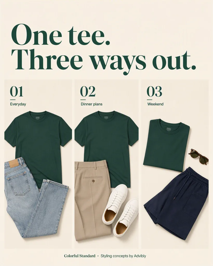
Choice-montage specimen: three styling directions around one tee. These are outfit concepts, not different product variants, verified fits or a bundle offer.
HubSpot's historical Trunk Club example cycles through outfits while retaining one promise. The constant message keeps the changing images from becoming an unrelated slideshow.
Sample execution: three notebook sizes. Put each notebook next to the same pen so the size comparison is meaningful. Label the views “Pocket,” “Desk,” and “Bag.” End with “Find your size.”
Keep the camera distance consistent. Enlarging the smallest notebook to fill its frame would undermine the comparison. If capacity or dimensions determine the choice, provide those details on the destination page.
You can test a side-by-side still against a short montage without changing the products or labels. That asks a useful question: does this assortment need movement, or is simultaneous comparison clearer?
6. Customer or creator proof
Use a person's experience when it answers a real objection. A face alone does not supply evidence, and a synthetic presenter cannot create a genuine customer history.
Start with the source material: an approved customer quote, a real creator demonstration, or a review you have permission to use. Preserve the meaning. A comment about appearance is not evidence of durability, and one person's experience is not a typical-result guarantee.
Sample execution without a testimonial: film a creator packing an actual bag for a commute. Show the items going in, then the closed bag. Describe what is visible. Do not invent “I've used this for six months” to make the clip sound more persuasive.
For U.S.-directed endorsements, the FTC's disclosure guidance says material brand relationships should be clear. For an image Story, disclosure belongs on the image where people can notice and read it. For video, it belongs in the video, not only in a description.
If you have a supported quote, compare quote-first with demonstration-first ordering. Keep the underlying evidence and any necessary disclosure in both versions.
7. Three-card sequence
Use a sequence when removing a step would make the message incomplete. Each card should move the viewer forward, while remaining understandable if it is the only card they notice.
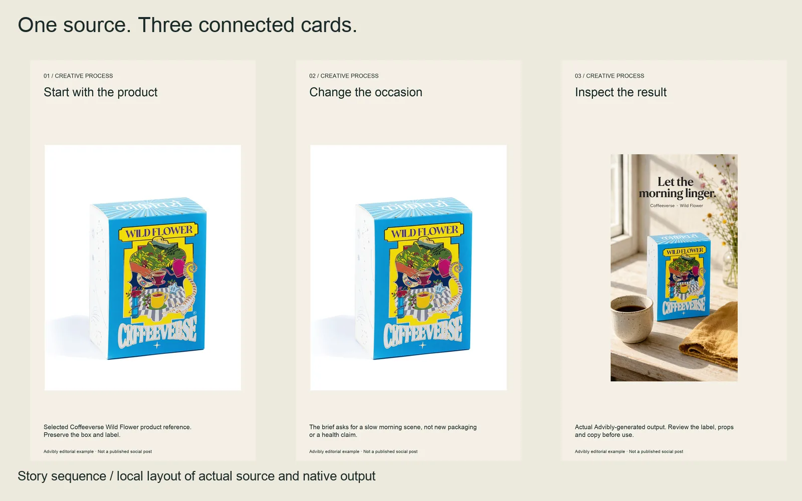
Actual three-card creative-process sequence: source, brief constraint, returned result. These are layouts of source/output evidence, not screenshots of the tool operating.
Open each 1080 × 1920 card: card 1, card 2, card 3.
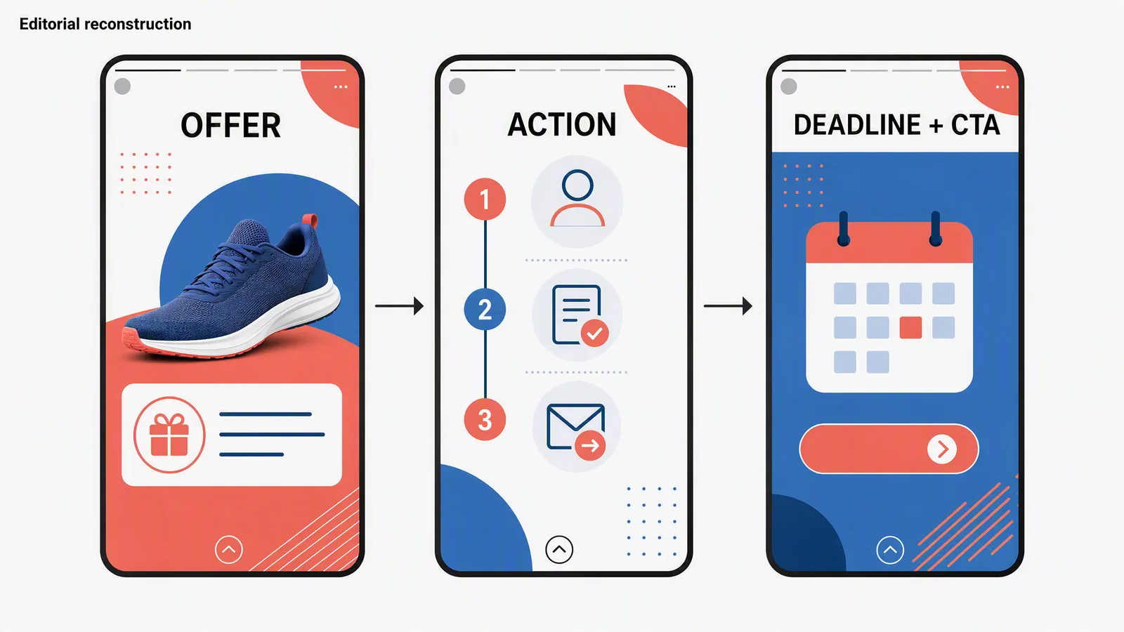
The promotion variant: offer, instructions, and a genuine deadline. Use real approved terms. The notebook sequence below is a product-explanation variant and does not need a discount or countdown.
For the hypothetical notebook-cover product, a useful sequence could be:
- Introduce the product. Show the open cover holding a notebook and pen. Copy: “Your notebook. Your pen. One zip.” Direct the viewer to the product detail page.
- Explain the storage. Show a close view of the interior pockets. Copy: “See where everything goes.” Link to the interior and fit details.
- Resolve the fit question. Show the closed cover being placed into a bag. Copy: “Check the size before you choose.” Link to dimensions and compatible notebooks.
There is no deadline in this example because none is needed. The final card resolves fit rather than manufacturing urgency.
Card order is a creative plan, not a guarantee of how every viewer will consume an ad. Check the current supported format and preview its delivery in Ads Manager. If the essential message depends on an uninterrupted sequence, consider making one video that contains the whole explanation.
8. Self-selection question
Ask a question only when the answer helps the viewer find something useful. The destination must honor the choice.
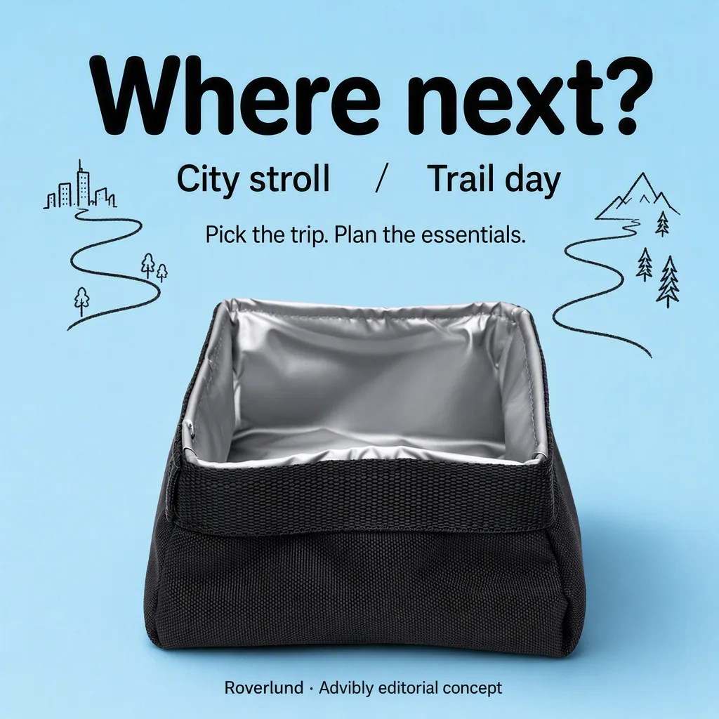
Self-selection specimen: the choices are plain copy, not working poll controls. Add an actual supported interaction only when preparing a separately approved Story.
Sample execution: “What travels with your notebook?” Show two clearly labeled arrangements: “Just a pen” and “Pens, charger, and cables.” Use “Find a cover that fits” as the action. The destination explains the two storage options rather than dropping everyone onto an unrelated collection.
You can communicate this idea in an ordinary image or video. A drawn button or poll is not an interactive control. Don't design an ad around an organic Story sticker unless that interaction is supported in the exact paid placement and account you're using.
For organic content, the same question can become a useful audience prompt. Keep that workflow separate from paid-ad setup; the Story scheduling guide explains why a prepared asset and a published Story are different states.
A complete brief you can hand to a designer
Here is the notebook-cover idea as a production brief. It is a hypothetical product concept; validate each physical feature against your own item before using the copy.
Audience: someone who carries a notebook between home, work, and a café.
Message: keep the notebook and pen together inside one zippered cover.
Main asset: one vertical product-first still. Photograph the open cover with a notebook and pen visibly in place. Keep the zipper and pockets in view. Use a plain background and leave space above the product for the headline.
Copy: “Notebook and pen. One place.”
Action: “See the inside,” linked to the product page's interior and size information.
Second version: use a closed-cover-in-hand photograph. Keep the headline, offer, audience, and destination unchanged.
Reject the asset if: the product shape changes, a pocket is invented, the displayed notebook does not fit, small text is unreadable, or the action promises information missing from the destination.
Test question: does showing the storage arrangement explain the product better than showing portability? Choose the campaign's success measure before launch. Clicks can show interest, but a purchase campaign also needs purchase outcomes; a higher click rate alone does not establish the better sales ad.
This brief is detailed enough to produce two comparable versions without prescribing every color or camera prop. For more starting concepts, use the Instagram post ideas library.
Check the finished Story at phone size
Use a dedicated 9:16 canvas, then inspect the exact paid placement. Don't assume a feed crop, an organic Story, and a Story ad have identical controls or delivery behavior.
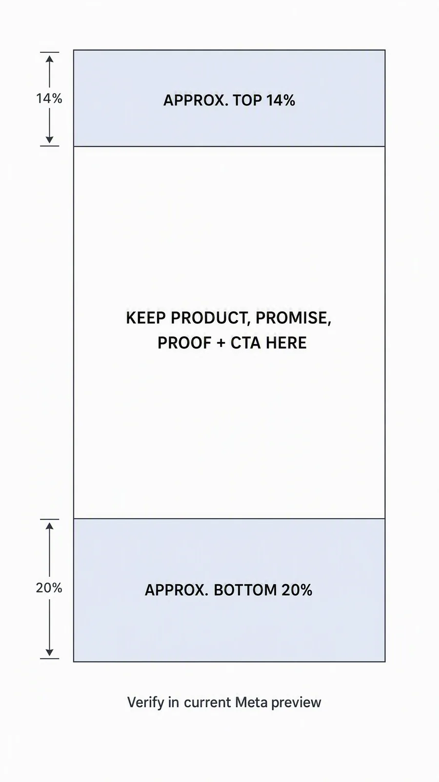
Conservative layout aid, not a guaranteed specification. The displayed margins are approximate; check the actual placement preview.
- Keep the headline, product details, and action clear of interface overlays.
- Read important offer conditions at phone size, not only on a desktop canvas.
- Watch video with and without sound. The central meaning should remain understandable.
- Confirm that the destination delivers the offer or information promised in the ad.
- Check rights for photographs, footage, people, and music. A track being available in an editor is not, by itself, permission to use it in an advertisement.
Use Meta's current Story-ad requirements for upload specifications. That page required sign-in during our September 11, 2026 check, so this article does not present its pixel limits, file limits, or safe-zone percentages as freshly verified requirements.
For the supporting question about background color: make the background part of your ad's source design and export it with the asset. Instagram's organic Story editor is a separate workflow, with controls that can vary by account and app version.
When you have the real product assets and approved copy, an image-ad creation workflow can help turn the brief into variants. Keep the same review criteria regardless of the tool: the product must be accurate, the claim supported, and the next action clear.