

The most useful video ads examples do more than inspire. They reveal a repeatable mechanism you can adapt to a different product, audience, and channel. The useful part is not the color grade, actor, or trending sound. It is the production logic underneath: what earns attention, when the product appears, what counts as proof, which variable changes between versions, and how the viewer is asked to act.
That distinction matters because copying the finish gives you an imitation. Reconstructing the mechanism gives you a repeatable brief.
The six patterns below cover common performance-marketing jobs. Each includes a scene map, proof requirement, variant strategy, and review question. Use them as production recipes, not as evidence that a format will perform for every product.
Key Takeaways
- Reconstruct the ad's mechanism instead of copying its visual finish.
- Match each pattern with evidence the product can genuinely supply.
- Keep one major variable isolated when the goal is to learn which change mattered.
Start with an example teardown, not a mood board
Before saving an ad as inspiration, reduce it to the decisions that made it work. A useful teardown answers 11 questions:
|
Field |
What to capture |
|---|---|
|
Objective |
The action the ad is meant to produce |
|
Audience tension |
The specific frustration, desire, or decision in play |
|
First two seconds |
The image, line, or change that earns the next second |
|
Proof |
What makes the promise credible |
|
Product moment |
When and how the product enters |
|
Scene map |
The minimum sequence needed to make the case |
|
Audio and text |
What each adds, including what survives with sound off |
|
CTA |
The exact next step |
|
Variant axis |
The one major element to change across versions |
|
Failure risk |
The likeliest reason the ad becomes misleading or unclear |
|
Verification |
What must be checked before launch |
This card separates creative direction from decoration. “Fast cuts and bold captions” is a style note. “Show the desired result in frame one, demonstrate the feature by second three, then change only the opening claim across three versions” is a production instruction.
Google’s guidance for app campaigns supports several parts of this lens: show the app experience quickly, frame the interface tightly, make the opening seconds count, and use audio and captions together. Those are useful review criteria, not a formula that guarantees performance. Google’s broader ABCD framework makes the same distinction through attention, branding, connection, and direction.
Six video ad examples, translated into production recipes
|
Pattern |
Best when |
Core scene sequence |
Most useful variant |
|---|---|---|---|
|
Product-in-action demo |
The value becomes clear when seen |
Result or friction → product action → outcome → CTA |
Change the opening angle |
|
Problem–mechanism–outcome |
The product or mechanism is unfamiliar |
Problem → why it persists → mechanism → outcome → CTA |
Change the audience problem |
|
Creator-style demo |
Direct explanation suits the channel and product |
Situation → product → demonstration → considered verdict → CTA |
Change persona or objection |
|
Before/after |
The transformation is visual and fairly reproducible |
Baseline → process → result → qualification → CTA |
Change the use case |
|
Comparison/choice |
The viewer is already evaluating options |
Choice → criteria → trade-off → best fit → CTA |
Change the decision criterion |
|
Offer-led response |
The product is known and the conversion event is clear |
Offer → product or proof → objection → terms → CTA |
Change offer framing or proof |
1. Product-in-action demonstration
Use it when: the product experience is the proof. This is often the strongest pattern for an app, SaaS feature, tool, or physical product with a visible action. The same evidence-first rule is central to a useful AI product video.
Scene recipe:
- Show the result or friction immediately.
- Put the product in use, not on a closing logo card.
- Make the relevant action legible.
- Show the visible outcome.
- Name the next step.
The opening can be result-first (“Turn this product page into a launch video”), problem-first (“Still rebuilding the same ad in three formats?”), or feature-first (“Resize the composition before you render”). Keep the rest of the ad stable if you want to learn which opening earns more qualified action.
Proof requirement: use authentic interface footage, accurate product photography, or a clearly faithful reconstruction. If the interface has been simplified for legibility, do not imply that the edited sequence is the literal product experience.
Review question: could a viewer understand what the product does with the sound off?
2. Problem–mechanism–outcome explainer
Use it when: the benefit sounds generic until the mechanism is understood.
Scene recipe:
- Name a narrow, costly problem.
- Explain why the usual approach fails.
- Show the product mechanism that changes the process.
- Connect that mechanism to a realistic outcome.
- Direct the viewer to the next step.
The difference between a useful explainer and an empty benefit list is the middle. “Create faster” is a promise. “Save product details once, then reuse them across briefs and formats” explains how the workflow changes.
Proof requirement: each consequential claim needs a source, product demonstration, or clear qualification. Animation can explain a mechanism, but it cannot create evidence for it.
Review question: does the ad explain why the outcome becomes possible, or merely announce it?
3. Creator-style demonstration
Use it when: a direct, social-native explanation makes the product easier to understand.
Scene recipe:
- Open with a credible situation or question.
- Introduce the product in that context.
- Demonstrate the relevant action.
- Give a specific, supportable assessment.
- Offer the next step.
This format has a bright red boundary: creator-style is not the same as customer testimony. A brand-created or synthetic presenter must not claim personal results, customer status, or lived experience it does not have. If a real creator or customer appears, confirm usage rights and the accuracy of their claims. Apply the same disclosure standard to any UGC-style video workflow.
Proof requirement: rights-cleared footage or explicit brand-created/synthetic framing, plus an accurate demonstration.
Review question: would a reasonable viewer mistake the speaker for a real customer describing a real result?
4. Before/after transformation
Use it when: the starting state and outcome can be compared fairly.
Scene recipe:
- Establish the baseline.
- Show enough of the process to make the change credible.
- Reveal the result under comparable conditions.
- Qualify the time, effort, or conditions that matter.
- Give the viewer a relevant action.
This pattern is persuasive because the contrast carries the argument. It is also easy to abuse. Different lighting, camera distance, time windows, inputs, or editing can turn a comparison into theatre.
Proof requirement: matched conditions and a representative result. If the example is illustrative rather than observed, label it as such.
Review question: would the transformation still look meaningful if both sides used the same framing and conditions?
5. Comparison/choice ad
Use it when: the viewer is choosing between methods, workflows, or products rather than discovering the category.
Scene recipe:
- Frame the decision.
- Name the criteria that actually matter.
- Show the trade-off.
- State which option fits which user.
- Invite the viewer to inspect the recommended path.
A fair comparison is more credible than a staged knockout. Manual editing may offer tighter continuity and control. A dedicated creator platform may offer a deeper actor catalogue. A multi-format creative workspace may fit better when product context must travel across video, static, and social assets. The criterion should decide the recommendation.
Proof requirement: current, like-for-like facts and explicit unknowns. Avoid competitor insults and universal-winner claims.
Review question: does the strongest alternative receive a fair explanation of where it wins?
6. Offer-led direct-response ad
Use it when: viewers understand the product and the main job is to make a clear offer actionable.
Scene recipe:
- State the offer or outcome.
- Show the product or supporting proof.
- Resolve the most important objection.
- Present material terms or genuine urgency.
- Use a direct CTA.
The destination is part of the creative. If the ad promises a free trial but the landing page asks for payment, the failure is not a weak edit. It is a broken promise.
Proof requirement: live offer terms, accurate conditions, and landing-page parity.
Review question: does the destination make the same promise as the ad?
Worked example: turn an app demo into three useful variants
Suppose a mobile app has a feature that turns a saved product page into a short campaign brief. The goal is three 15-second vertical ads. The feature is easiest to understand when seen, so the product-in-action pattern is the right starting point.
The teardown card
- Objective: get qualified viewers to open the feature page.
- Audience tension: marketers repeatedly rewrite the same product facts for each creative brief.
- First two seconds: show the completed brief, then the product page it came from.
- Proof: authentic screen capture of the source import and generated brief.
- Product moment: the interface appears by the second beat and remains legible.
- Scene map: outcome → old friction → source import → brief result → CTA.
- Audio and text: narration explains the change; captions preserve the claim with sound off.
- CTA: “See how the workflow works.”
- Variant axis: opening angle only.
- Failure risk: implying every source produces a finished, accurate brief without review.
- Verification: UI accuracy, claim wording, caption timing, safe zones, CTA destination, and product-owner approval.
A 15-second scene plan
0:00–0:02: Outcome. Show the completed brief with one readable line highlighted. On-screen text: “One product page. One usable brief.”
0:02–0:05: Friction. Two quick cuts show product facts being copied into separate documents. Do not invent a time-saved statistic.
0:05–0:10: Product action. Show the real source import and the brief being created. Crop tightly enough for the interaction to be understood on a phone.
0:10–0:13: Result. Return to the brief and highlight the audience, claim, and CTA fields. This is where the mechanism becomes visible.
0:13–0:15: Direction. End with the product name and a CTA that matches the landing page.
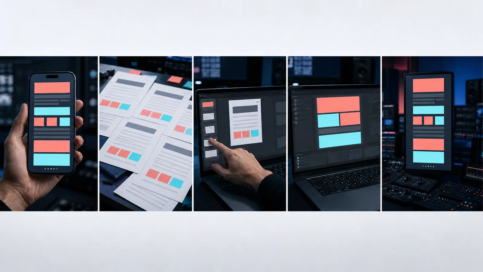
Google recommends reaching the app experience quickly and using early visual changes, close interface framing, audio, and captions in app creative. Apply that guidance here because it helps the viewer understand the product, not because checking every box guarantees a result. Its creative guidance system also checks concrete attributes such as early branding, voice-over, duration, and format coverage.
Make the variants diagnostic
Create three versions from the same body:
- Result-first: open on the finished brief.
- Problem-first: open on duplicated product facts across documents.
- Feature-first: open on the source-import action.
Keep the scene sequence, proof, offer, CTA, audience, and destination stable. Then the comparison can tell you something about the opening. If every version changes the hook, actor, script, proof, pacing, and offer, you have three ads but no clean test.
This does not mean one-variable tests are the only valid creative strategy. Large conceptual differences are useful when exploring direction. They are simply poor evidence for declaring which isolated hook, actor, or CTA caused the difference.
Adapt the composition; do not just crop the master
A vertical ad, square ad, and horizontal ad do not offer the same reading space. Interface details that work in 16:9 may become illegible in 9:16, while a centered subject can collide with platform controls.
Build the idea once, then compose each delivery format around its placement:
- keep the key product action inside safe areas;
- resize text for the actual viewing surface;
- preview captions and controls together;
- confirm the opening still reads at phone size;
- check the latest platform specifications before export.
Google documents vertical, horizontal, and square video requirements across its placements. Meta also supports video across feeds, in-stream placements, and Stories, each with different viewing behavior. Link to current specifications rather than hard-coding a long list that will age.
Use inspiration libraries without confusing selection with causation
TikTok’s Top Ads library is useful for observing current creative. It is not a controlled experiment. A visible ad does not reveal all of its targeting, spend, landing-page quality, offer strength, failed siblings, or business economics.
Use a library to collect patterns:
- Save examples that match your audience and objective.
- Complete the teardown card for each.
- Group them by mechanism, not visual trend.
- Choose one pattern whose proof you can supply.
- Change one major variable across diagnostic versions.
- Judge the result against the campaign’s actual conversion event.
The goal is not to make an ad that looks like a winner. It is to make a clear, supportable ad and design the next version so it can teach you something.
Choose the production method that protects the proof
The best production route depends on what the ad must prove.
Use authentic footage and manual editing when product accuracy, customer trust, physical handling, or shot-to-shot continuity is central. This route usually gives you more control over the evidence, even if production takes longer.
Use a specialist creator platform when the format depends on a broad actor catalogue, localization, or presenter-led delivery. Verify how synthetic identity and testimonial-style claims are handled.
Use an AI creative generator when the script and claims are approved, the concept benefits from fast visual iteration, and every generated detail will be reviewed. Lower render effort can create more review work when text, hands, products, or continuity drift.
Advibly’s AI video ad generator fits the third route. It can use saved brand and product context to generate short product and UGC-style video across multiple models and aspect ratios. Its reusable creative skills can support structured workflows such as storyboarding, rendering, and stitching. It does not supply campaign evidence, authentic customer testimony, media buying, or a performance guarantee. Product details, claims, interfaces, and final assembly still need human verification.
If that workflow matches the job, start with one completed teardown card and approved source material. Generate the shots or versions the recipe requires, then review them against the same proof, format, and destination checks you would apply to any production method.