
An AI thumbnail maker can speed up concepting, but the tool does not decide what earns attention. A strong thumbnail makes one accurate promise, stays readable at feed size, and is different enough from the alternatives to produce a useful test. The practical workflow is brief, generate, reduce, preview, and test.
Key takeaways
Design around one viewer promise, not a summary of the whole video.
Create three meaningfully different concepts, because YouTube can test up to three thumbnails concurrently.
Choose the winner by qualified viewing, not clicks alone. YouTube's native experiment uses watch-time share.
What does an AI thumbnail maker actually do?
An AI thumbnail maker turns a creative brief, product references, brand assets, and a desired composition into candidate images. It is most useful before final design: exploring focal subjects, crops, backgrounds, and visual metaphors faster than building each direction by hand.
It is not a substitute for positioning or testing. If the brief does not identify the viewer, the video promise, and the evidence inside the video, generation produces polished guesses. If every candidate changes only a color or facial expression, the test cannot teach you much.
Start with a one-sentence thumbnail brief
Write the brief before opening the generator. A useful sentence is: Show [recognizable subject] experiencing [specific tension or result], with [proof element], for [viewer], while preserving [brand cue].
For a product walkthrough, that might become: “Show the real dashboard beside the messy manual workflow it replaces, for operations leads, using the product's charcoal and yellow palette.” This is more direct than “make a viral SaaS thumbnail.” It also gives a reviewer something concrete to approve.
|
Brief decision |
Question to answer |
Common mistake |
|---|---|---|
|
Viewer promise |
What will the viewer understand or see? |
Repeating the complete title |
|
Focal subject |
What must be recognized first? |
Giving every element equal weight |
|
Proof |
What makes the promise believable? |
Inventing an interface or result |
|
Destination |
Where and how small will it appear? |
Approving only on a large canvas |
|
Brand cue |
Which one or two cues identify the source? |
Turning the thumbnail into a logo board |
Generate concepts that test different ideas
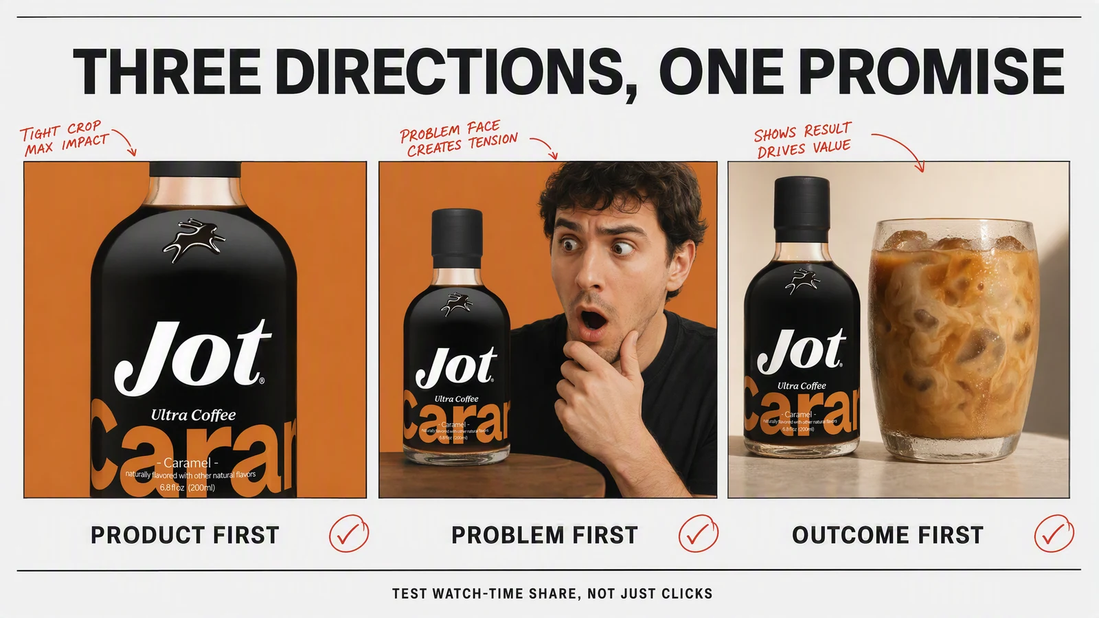
Generate three directions with distinct hypotheses. One can lead with the product, one with the consequence of the problem, and one with a before-and-after contrast. Keep the underlying video and audience fixed. That isolates the effect of the creative direction better than changing the topic, promise, and style at once.
- Product-first: Make the real product or interface the largest object. Use this when recognition or proof matters most.
- Outcome-first: Visualize the result the viewer wants. Keep it plausible and supported by the video.
- Tension-first: Show the problem, contrast, or unresolved question. Avoid manufactured shock that the content cannot repay.
This is the key distinction between variation and duplication. Three color treatments of the same composition are duplicates. Three different reasons to click are testable concepts.
Use the correct thumbnail size and crop
For YouTube, work in 16:9 and export at high resolution. YouTube's current custom thumbnail guidance, retrieved August 4, 2026, recommends 3840 by 2160 pixels, a minimum width of 640 pixels, and JPG, GIF, or PNG. The page also explains that vertical videos can receive an automatically generated 4:5 image on some mobile surfaces, so the same asset will not always appear unchanged.
Resolution is only the starting point. Preview the image at the approximate size of a home-feed card and on a phone. If the product, face, or contrast disappears, simplify it. If the text needs zooming, remove words before shrinking the font.
Keep thumbnail text short and additive
Thumbnail text should add a second piece of information, not copy the title. A title such as “I rebuilt our onboarding in 48 hours” does not need the same sentence inside the image. The thumbnail might say “BEFORE / AFTER” beside a clear interface contrast.
Use one short phrase, strong contrast, and enough empty space around the letters. Check every generated character manually. Image models can misspell product names, prices, and interface labels, so final typography is often safer in a design editor.
Protect accuracy and originality
Use assets you own or have permission to use. Do not imitate another creator's recognizable thumbnail system closely enough to confuse viewers. Do not generate a celebrity, customer, or competitor endorsement that did not happen. And never show a product result that the video cannot substantiate.
For software, use a current screenshot or an abstract composition rather than a fabricated UI. For physical products, preserve packaging, proportions, labels, and variants. Generative details that look harmless at first glance can become the most visible source of distrust.
Test thumbnails with watch time, not intuition
YouTube's Test & Compare documentation, retrieved August 4, 2026, says eligible creators can compare up to three thumbnails on public long-form videos and podcast episodes. Tests run concurrently, results can take a few days or up to two weeks, and the outcome is based on watch-time share rather than click-through rate alone.
That metric matters. A misleading image may win the click and lose the viewer. Watch-time share rewards the thumbnail that attracts people who actually stay. YouTube also cautions that a test may return “Preferred” or “None” when there is not enough evidence for a statistically confident winner.
Do not stop at the winning image. Record the hypothesis it supports: product proof beat a reaction face, a concrete result beat a vague mystery, or the simpler crop held up better on mobile. That observation should shape the next brief.
A review checklist before upload
- Can someone identify the main subject in one glance?
- Does the image make one promise that the video fulfills?
- Is any text readable on a phone without zooming?
- Are product details, claims, and likenesses accurate?
- Does the thumbnail still work when cropped or reduced?
- Are the three test concepts meaningfully different?
- Have you saved the prompt, source assets, and test result?
Where AI fits in an on-brand workflow
Advibly can use saved product and brand context to generate static concepts, then carry an approved direction into image ads, carousels, and product videos. The useful part is continuity: the same source assets and creative decision remain available after the thumbnail is chosen.
Frequently asked questions
Can AI make YouTube thumbnails?
Yes. It can generate backgrounds, compositions, and concept variations. You should still verify likenesses, product details, spelling, rights, and compliance before uploading.
How many thumbnail concepts should I create?
Create at least three distinct directions if you plan to use YouTube's native Test & Compare feature. More rough concepts can be useful during ideation, but narrow them to a small set of genuine hypotheses before testing.
Should I optimize for click-through rate?
CTR is useful, but not by itself. A thumbnail should attract the right viewer and accurately set up the video. YouTube's native test therefore uses watch-time share to determine its outcome.
Do Shorts use custom thumbnails in the same way?
No. YouTube says Test & Compare is not available for Shorts, and thumbnail display varies by surface. Treat the opening frame and the in-app selected frame as part of the short-form creative.